To help us construct our own we used examples of some real ones, and looked for what the different conventions are in a magazine advert. We mainly used the image above which is an example of magazine advert for the artist, Jessie J.
Above is our first draft of our Magazine advert. We decided that as the narrative and the visuals of the music video was quite dark, we were going to go for a dark appearance. We chose to use a still from the music video which features the protagonist in the narrative that is a close up to his face but it has been dimmed out. A black background was chosen next as we found that it makes the protagonist look as if he is part of the background (as you can see in the still, we have applied a fade look on the edge of the still). We included the band/artist name called 'spur' and we decided to use a white font as it would make the name stand out and contrast from the black background. We've also included the album name which is called 'flames'

We decided that the font for the band name was going to be a plain and simple font and we decided that the colour should be white since we planned on having a dark background, the colour white would be able to make the band name stand out.
Below is the first draft of our magazine advert. We've applied the still and the title to the advert as well as the black background and we've included some other details such as ratings and the website since most real digipaks would do the same
Below is the second draft of our digipak. Some of the changes we made was that we changed the font of the band name since we felt that it wasn't standing out well enough. Also, we included a line at the top of the still saying that the album is out now since this was an advert.
Below is the third draft of our magazine advert. More changes were made to the overall look. We felt that the advert was lacking a variety of different colour. We noticed it was mostly dominated by black and white so for the album name, "Flames", we decided to colour it in orange as it's the same colour as real flames. Additionally we also included a label saying what songs the album will include on the top of the still.
Initially we believed that the draft above would be our final product but from looking at it constantly from time to time, we felt that it didn't look really professional and it was lacking a couple of things such as colour, meaning and realism so we decided to start again.
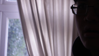
For the background, we decided to use the image below we took ourselves. It's not a still from the music video. we weren't going to use a simple background that we could simply edit it. We instead used the darkness of the photo for our background. In terms of the image itself, we decided that since we wanted colour, we used a red filter. This was because it would convey the message of how the person in the image (who's the protagonist in the narrative of the M/V) is in danger since connotations of red is danger and also, it would make the magazine advert look more colourful.
Below is the fourth draft of our magazine advert. we used the image above for the background and we still applied the thick font for the band name. We changed the album name since it didn't really sound like a name for an album and also, it sounded too similar to the track we used. We changed it to "THE NEW SOUNDS". We also included labels we previously used such as what the album will include and the website. We also included a logo at the bottom left of the advert for synergistic link purposes.
Below is our final draft of the magazine advert. we showed the magazine advert above to an audience and we received feedback. They said it looked more convincing comparing it to our first draft. However they felt that the band name was too thick. It didn't look like it was part of the advert as it looks like it was simply just stamped on the advert because it didn't match the font of the other labels.
We took note of this feedback and decided to make the font of the band name thinner. It's more similar to the other labels and from receiving more audience feedback, they felt that the thinner font looked better.


No comments:
Post a Comment
Note: only a member of this blog may post a comment.