Sunday, 14 January 2018

Evaluation - Question 3 (Axl Santos)

What have you learnt from your audience feedback?

From showing our 3 products to our audience, we have received a mixture of positive and negative feedback.

Before creating our music video, we got feedback which would definitely help us in making our final product look much better. Below is the feedback we got for our animatic and I feel this was the most important feedback as the animatic was like a draft of our final music video. We learnt a lot from the feedback given. One example of feedback given was making sure that each scene cuts perfectly to the beat of the track. We took note of this and so we made sure we would apply it to our final product.

MUSIC VIDEO:


From showing our audience our music video, we found out that they all followed our preferred reading. Our preferred reading was the plot of the narrative: That the protagonist who is a drug addict has a massive love for the drugs he takes but doesn't know or care about the negative effects it can have on the consumer's body. The audience said that they noticed it clearly with what they saw was happening in the narrative with the protagonist hallucinating, fainting and feeling extreme pain. They believed that we were trying to show how bad drugs are to the body no matter how pleasing it may be to have them, which was what our preferred reading was.

However, we also learnt from the audience that to them, the performance of the artist was very energetic and upbeat and so some of the audience suggested how the music video as a whole was like a representation of youth. How there are the positive and negative sides of what young people our age usually experience. The performance would represent the positive and joyful side of youth since the music video, the artist is shown to be enjoying himself play the instruments and it contrasts with the protagonist in the narrative where he is in the darker side of youth trying to have the time of his life but takes the most dangerous approaches.

Additionally received feedback that the music and visuals were working very well. Our audience agreed that the timing of the cuts between the narrative and performance were on point and the lip sync was very well synced and I think this is very important feedback because i'm more convinced that when the music and visuals to have a strong relation (As what Goodwin stated) then it's able to make a music video look very convincing.

Overall we learnt that they had the reading which we intended but also some have expanded on our ideas and thought ahead of us.

MAGAZINE ADVERT:


From showing our final magazine advert, we received a mixture of both positive and negative feedback. The positive was feedback was that they really liked the colour that was used in the magazine advert. They believed it linked with the music video as the protagonist in the music video was in danger with the actions he undertook and the fact that the colour red was used in the advert which the audience connoted it with danger showed that there was a connection. They also agreed with how even though the main image for the advert isn't shown in the music video, the darkness of it still carries on and it reflects how the narrative was also very dark.

However we received some opppositonal readings from the audience as well which was mostly concerned with the titles and the image which is linked with it. Some of the audience had question if the actor's name was called "Spur" and that if this was the actors album. after saying it wasn't, they felt that the main image should have been an image of the artist instead of the actor since it was really the singer who's the artist and that the singer should be the main focus. It was understandable that the audience would read our magazine advert like this since most real magazine adverts would have the name of the artist with the artist as well as the main image but our magazine advert didn't conform to that.

Overall I think it was the most important feedback and I've learnt that the magazine advert as well as the digipak should usually focus more on the artist rather than the actor since most real magazine adverts would do that and it wouldn't cause any oppositional readings.

DIGIPAK:

For showing our digipak, the way the audience responded was that they thought the colours in all the covers fitted well with the music video since the same dark colours were used so they noticed there was a synergistic link. However, we still had complaints with the titles and it was a similar problem with the magazine advert. Some of the audience thought that the actor was the artist so therefore they haven't given us our preferred reading.


Evaluation - Question 2 (Axl Santos)

How effective is your combination of your main product and ancillary texts?

Our Three Products:

1) Music Video
2) Digipak
3)Magazine Advert

I think we were quite successful in creating 3 products that were effectively combined to create a promotional package for the release of an album/song. This is because when looking at them all together, we can see that they are similar and so we can make clear connections between them. This is because of the audience feedback we received from time to time and also because of the synergistic links we had.

Synergy:

Magazine Advert

Digipak (The bottom middle is the front cover)

In the two products above, It contains the same image of the protagonist of the narrative looking straight forward with no emotion and a dark red filter. This shows synergy as since the same image is used, an audience can clearly see that they are linked with each other. The image wasn't a still from the music video but rather a seperate photo for these two products so there's a link between the digipak and magazine advert but not for the music video.

The Text:

Digipak

Magazine Advert
When we were picking a font, we wanted to go for a simple but eye catching look. We therefore chose to use this thin looking font coloured white. At first for the magazine advert, the font was much thicker but when we received audience feedback that the fonts for the digipak and magazine advert should be the same to show synergy, we changed it also to a thinner font. Both products show the band name and the album in the same white fonts.

The Actor and musician:

We used the same actor and musician for the music video and our two print products. The same musician was used for the digipak and music video to establish that he was the artist but we used the same actor for all three products as we felt the actor was our main synergistic linker.

The Singer/Artist
The Actor

Other factors:

- We also used the same red filter over the actor. We wanted to show how it's about a character who is in danger so having this red filter which connotes danger was important to have in the two print products in order to keep the meaning.


Other Examples of Real Media products that show synergy:

Olly Murs - "Right Place Right Time"

Olly Murs Magazine Advert
Olly Murs (Digipak)

From looking at some real examples like the one above, there are also some similar features which creates a synergistic link for the audience. For example, having the same image of the artist in both products. That creates a synergistic link for the audience to only look at the artist and associated it with the album. Also, the same font used for for the album and artist's name. Since it's a unique font that the record labels made, it would be easy for the audience to associate that kind of font to Olly Murs, the artist.


Panic at the Disco - "Too Weird To Live Too Weird To Die"


Panic at the Disco (Magazine Advert)


Panic at the Disco (Digipak)

Similar with Panic at the Disco's advert and digipak, it has many synergistic links such as the same artist in the covers, the same font used for the artist's and album's name and also the same black and white filter with the coloured smoke.


Evaluation - Question 1 (Axl Santos)

In what ways does your media products use, develop or challenge forms and conventions of real media products?

Music Video: 

The track that we have chosen to use for our music video is called "Fire" by Spur. The genre of the song is alternative rock. "Alternative rock is a style of rock music that emerged from the independent music underground of the 1980s and became widely popular in the 1990s.


Andrew Goodwin's features:

In Andrew Goodwin's theory on music videos, it suggested that a successful music video would contain these features. The features are:

1) Demonstrates genre charactreristics

2) A relationship between the lyrics and the visuals

3) A relationship between the music and the visuals

4) Close ups of the artist; used by the record label to market and advertise the artist

5) A reference to the notion of 'looking' or voyeuristic treatment of the female body 

6) Intertextual References (to films, TV programmes, other music videos etc.)


We tried to apply some of Goodwin's features to our own music video in order to make it look more realistic, similar to real music videos produced by record labels, and also convincing to our audience that it was a music video.

How our music videos shows different features of Goodwin's theory:

 Some conventions of rock genre:

- Performance shots of the band playing
- A narrative to go along with the performance
-close ups/extreme close ups used
- set in studios (usually the performance)
- Mise-en-scene (Costume, make up). Creates the character


Our music video conforms to most of the conventions of the rock genre as well as some of Goodwin's features as well. For example, our music video shows performance shots of the band playing. Despite the fact that it was only one person playing different instruments, it still conformed to the performance convention. It also demonstrates the genre characteristics since the performer is shown to be playing many musical instruments and that musical instruments like the ones shown in our music video mostly associates with the genre rock, it's easy to identify that our music video falls into the alternative rock genre.

linking it to some real music videos such as "Smells Like Teen Spirit" by Nirvana, they also show performance shots of the band playing. However, they focus more than us on the band performing but it still shows a relation and that our genre is similar to theirs.


There is also a narrative in our music video. It is separate from the performance as it's a different person as the protagonist for the narrative and it's not the same person who's performing as well. The narrative in out music video is mixed in with the performance so from watching through the music video, it constantly switches from some performance to the narrative and back to the performance. This would follow of how not only the performance is partnered with the narrative but it also follow one of Goodwin's features of how there is a relationship between the music and the visuals. When it switches from the chorus to the verse, there is also a transition between the performance to the narrative. This is because we decided that since the verses had more of the narrative lyrics, the verses that are sung would show the narrative whilst the upbeat chorus would show the performances which is also upbeat. 


Another convention our music video follows is that the performance shots is set in a music studio. From looking at some examples, we found out that the performances in an alternative rock music video are set usually on a performing stage or studio and so we also decided that the musician in our music video would perform in a studio too. An example of a real music video set in a studio is "Semi-charmed life" by Third Eye Blind which is shown below.


Additionally, since there is a narrative in our music video, it's able to show how there is a relationship the lyrics and the visuals. We researched and discussed the meaning of the lyrics and we agreed how the lyrics was about someone having a strong love for something that too much of it can destroy the person themselves. We decided that protagonist would be a drug addict who takes drugs in order to make himself feel better. At first he feels fine from taking the drugs but he doesn't realise the severe impacts it can have on himself such hallucinations, headaches and passing out but it seems that the protagonist doesn't really care and recklessly does it anyway. An example of how the lyrics and videos are linked is that part of the lyrics were "You could be the one to drown me out" which we implied meant that the person is totally in love with his own drugs that he wants the drugs to destroy himself. The protagonist as the lyrics are said is shown to be looking out thinking he's in outer space when really its just him hallucinating.


Another one of Goodwin's conventions that are followed as well as one of the rock genre conventions as well is that there are many close ups and extreme close ups of the artist. In the performance shots of the music video, we have the "singer" shown to be singing which establishes him as the artist. This is very common in the rock genres since in most rock music videos, it always shows the singer singing since they are the ones who are creating the music. Linking it to some real bands such as Red Hot Chili Peppers, they also have close ups of the artist singing.


Digipak:


Conventions of a Digipak:

1) The artist's name
2) An image/logo of the artist
3)A song list
4)An insert (Could perhaps be a booklet with info about the music, artist or a poster)

From looking at our digipak, we can see that it uses some of the conventions. For example, the front cover of a digipak would feature the artist's name in bold as well as the image of the artist. It can be said that it follows the conventions but also challenges because of the fact in our front cover it shows the the band name and album name but the image shown isn't the artist but instead is the protagonist of the narrative. We found that it caused some confusion with the audience as from receiving feedback, some people believed that the actor was the artist and instead should've shown an image of the singer instead. However, it does conform that it shows the the artist/band name on the digipak. For ours, we made the name "Spur" stand out to make it easy for the audience to see that it's an album by Spur. Which is why the font colour of the name is white as it contrasts with the dark image behind it.

Similar to some real digipak front covers which we used as an example, it shows the name as well as the image.


Similar to most digipaks, we did not use any stills from the music video but rather we took a separate image of the actor. This is so we could conform to what most digipak front covers look like.


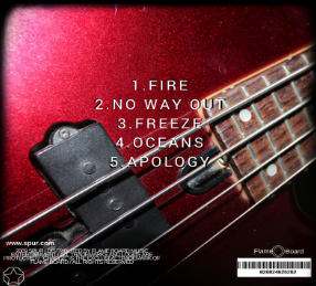
 We included a song list at the back cover like what most Digipaks would have so we also conformed to the convention as well.


Examples of real song lists:


We included a booklet inside the digipak which would therefore conform to the convention of a digipak. The booklet included the lyrics to the song and also a still from the music video.

Lyric Booklet


stills we used for the inside:


examples of real booklets inside real digipaks:


Magazine Advert

Conventions of a magazine advert:

- The artist's name
- An image of the artist
- The Album title
- reviews/ratings
- where to find the song

Similar to our digipak, the magazine advert shows the band's and album's name. the same image of the actor is also shown which creates that synergistic link between the products. The band name in our magazine advert is large and is very clear for the audience to see. It conforms to how the artist's/band's name is very dominant and it stands out to make it eye catching.


Similar to some real magazine adverts like the one below, the name of the artist stands out so it can be the first thing the audience sees.


MICHAEL MEROLA EVALUATION - QUESTION 4

4.How did you use new media technologies in the construction and research, planning and evaluation stages?

     Firstly, one new media technology that we used heavily during the research stage of our music video was YouTube in observing and taking notes at not only other popular music videos for inspiration, but in general watching clips from films and television programmes to inspire us to use any techniques that we saw that could possibly work in our music video.

Image result for YouTubeIn addition, we analysed many digipaks right from the beginning of the process in order to gain knowledge on the most essential features of a digipak, its style and common format.


     We already knew how to operate our DSLR cameras as we had worked with them on previous tasks and projects, most notably our thriller opening from Year 12. We also had previous experience with the lighting equipment. We noted any mistakes or problems that occurred whilst making our thriller opening beforehand to make sure that the issue would not happen again.


Image result for dslr camera
     We used blogger during all three phases of production. In pre production, we used blogger to post our research onto which included things such as research into music genre, music videos and digipak designs. We also used blogger during post production in order to post the final product of both the music video, the digipak and the magazine advert.


     We also used soundcloud as a way of finding the song which we would use. We chose this website as it was easy to access and use in order to search for songs which had not been copyrighted (unsigned artist). It was also simple to download a song from this website that we liked.


Image result for soundcloud
     Another media technology we used for the creation of both the digipak and the promotional poster for our magazine advert was adobe photoshop. We chose this software as it was easy to use and it was very simple to make any changes to our product which was particularly useful as we were constantly getting audience feedback on any changes and improvements that we could make in order to ensure that our product was the best it could be. For example, we were constantly changing the font, size and style of the word "SPUR" as there was a varied difference between audiences opinions. However once we had narrowed it down to two possible font designs, one was more popular by a big margin, and so therefore we stuck to the design below on the left hand side.


     We used final cut pro to edit our music video. We chose this editing software as it was not only the best editing software available to use for us but it was also easy to use and it was simple to edit anything once we received audience feedback. We also were able to add some special effects in an attempt to enhance the product.


     We also used the iMac computers to edit the music video on as well as posting things for our blogs. I found the iMacs easy to use as we had used them before for previous projects and it had all of the most important software we needed to use already on it and as a group, we were all familiar with these programmes. Importing and exporting clips was also very easy to perform.


MICHAEL MEROLA EVALUATION - QUESTION 3

3.What have you learned from your audience feedback?

     From our first audience feedback during pre production, our group learnt the following things. Firstly, in one particular shot, some people thought that one filming effect may be too difficult to execute well and so therefore we tested it out a few weeks before we started production and the end result was not to our satisfaction and so therefore we scrapped it and replaced it with a similar scene but with no camera tricks.

     Once our first draft was edited together, we asked for audience feedback. Most people critically praised the narrative part of the story and how it fitted the beat of the song itself. However, some band shots did not and so therefore we worked on that area of the video to improve it. Once we were happy with it after re watching the entire video many times, we exported the edit and displayed it to a large audience as a final product. Many people enjoyed the mysteriousness and bizarreness with occurs due to the main character taking drugs and seeing things that are not really there. Everybody successfully identified that the narrative part of the song was themed around the issue of teenagers taking drugs and the harmful effects that occur as a result.

     Overall, after viewing our music video for the first time, our audience reacted very positively. One of our aims for our audience to understand was to not only make sure they understand what is going on in the music video itself visually but also to create questions and a sense of mystery as for example, no information is presented to the audience regarding the background situation of the main protagonist and so therefore the audience is constantly questioning the intentions and reasoning behind the protagonist taking drugs. As creators, our thinking process behind why the main character decides to take drugs was a consequence of him trying to forget and wipe from his mind that he has just recently experienced an end of a relationship with someone as is indicatedd by the songs lyrics. Effectively, he is escaping his depression by taking drugs in an attempt for him to move to an alternate reality. However, once he is in this alternate reality, he becomes frightened and scared at what he sees and immediately regrets his decision, as is seen when he has his head on the dinner table.


     Once we had uploaded the video on YouTube to the public, we were able to statistically analyse people's opinions about the video if they chose to leave a comment or like or dislike the video. Of course this is optional and so all the data we gathered from this was not from every person who watched the video. Overall, so far, the video has received five likes and one dislike and one comment irrelevant to the video itself. This means according to the data of the like and dislike buttons, it had an approval rate of 83.3%.


     We also received mixed feedback on our magazine advert. From our first draft of our advert, many  people were quite positive about it and its overall look and feel. However, some negative criticism we received was due to the font of the text being not particularly eye catching or eye pleasing. The positioning of the text was also not to people's liking and so therefore we took this criticism onboard and we edited and altered it to make it look overall better, which it did. Once we showed the final print product to a selected audience, they really enjoyed it, its simplicity but also the darkness and question marks surrounding it as it doesn't give away many answers at all on what the song is about, its genre and its intended target audience. However, it can be argued that its target audience is for teenagers based on the fact that its artist and the actor in the music video is of a similar age.

MICHAEL MEROLA EVALUATION - QUESTION 2

2.How effective is the combination of your main product and ancillary texts?

     The combination of our main product and ancillary texts have worked well. The ancillary texts reflected the theme and mood of the music video well. The background of the promotional poster is quite dark, reflecting on the negative theme of drugs and its harmful effects quite well. As the songs title is called "Fire", we added elements of colours normally associated with fire such as red as a form of synergy. We also made and constructed an image of a star in an octagon to also show synergy and also to identify and establish a well known symbol for this artist. This can also be called the artists logo. However, we decided to not place the symbol on the front of the digipak to keep it more simplistic and in order to keep most of the information on the back cover.


Magazine Advert


Digipak (Front Cover)
Digipak (Back Cover)

     Both the digipak and the promotional poster contain the same image of the actor, including the background lighting. The textual display (font, size and positioning) is also the same. The font itself is in capital letters so it is readable and the white colour makes the title stand out from the dark background behind. We also titled the album "The New Sounds" in order to give emphasis that this is a new product. The word new is also attractive to consumers who value newer products as those which have better quality than products that are already out in the market.

    The actor (displayed on the front cover) gives off little to no emotions signifying that the songs inside are quite negative or that the lyrics may contain a darkened story, which is does.


   Any ordinary member of the general public could clearly identify the similarities between both the magazine advert and the digipak. This means there would be no issues with consumers trying to identify, find and locate the digipak solely based on the advert they saw. The advert in general is also extremely readable for passers by to quickly look at whilst they go about their daily business and during this time, they would be clearly able to identify what it is advertising and the posters contains information in which they can easily access to increase their interests, leading them to make purchases of the product itself.

     Here is an example of an artist using the same/similar images for both their digipak and advert.

Digipak:

Image result for digipakcover

Advert:

Image result for digipak cover hullabaloo


     Our digipak also contains the lyrics to the songs in the album in the form of a booklet found inside the product, therefore it would provide great convenience for consumers to find the words to the song if they chose to sing along to the song. It also allows the consumer to understand what is really being said in the song itself as often, people don't understand the full meaning behind the lyrics of a song. The image on the back is also shown in the music video itself, linking the music video with the digipak once again.


MICHAEL MEROLA EVAULATION - QUESTION 1


1.In what ways does your media product use, develop or challenge forms and conventions of real media products?

     During the pre production process of our music video, we took inspiration from pre existing videos. We tried to find a song that not only sounded great but also had good potential to create a fantastic music video around. Once we all agreed on a certain non copyrighted song, we started planning out the storyboard. Whilst creating it, we did look at other music videos and noted that most commonly, there are two popular elements that make up a music video, a narrative element and an instrumental element where shots of the singer and/or instruments are visible. We took this knowledge and inserted it into our storyboard by having these two elements in our own storyboard. Our narrative dealt with the issue of teenagers and drugs as our central main character suffers the effects of taking drugs. Drugs and other political issues are often seen in real media products.

     We also thoroughly analysed the songs lyrics as it is crutial to understand what is happening and what is being talked about in the song in order to produce a relevant music video for it. Whilst analysing the lyrics we understood the explaination and emotions behind the essential singer of the song, who they are talking about and why they are talking about this certain person in a particular and strongly emotional way.

     We also looked into Andrew Goodwins theory on music videos. He suggests that live instruments, close ups, a liberal lifestyle, lip syncing and the video itself to be set in a studio is key in creating a successful music video. His theory inspired us to create band shots which would appear in between the narrative shots as during our first draft, our main focus was too much on the narrative part of our music video, less focusing on the instrumental part.


Image result for digipak advert

Image result for digipak advert


     Our digipak and promotional magazine advert follow the conventions of real media products. It contains a title that stands out well as well as key information regarding the date of when it shall be released. It also shows the main artist as its main focus point. Many bands do something similar to this and we took note of this and applied it to our work. However, we decided to use the actor in the music video as the main image and focus point of our digipak and front cover as we felt that in the music video itself, the audience would be more connected to the narrative character than the musician. We also included the website at the very bottom of the advert in order allow people who are interested an easier way to research more on the artist and their new album.

     We also decided to include the words "The Hit Single-Fire" on the magazine advert as a way of communicating to the consumer or to the general public that the artist has had great success with one of the songs placed in the album, heightening the overall quality of the product and the surrounding praise and positive criticism around it.

     On the front cover of the digipak itself, we included the words "Bonus Collection Set" in order to attract more people to purchase our product. This is because we felt that generally, people would be more likely or more tempted to buy a product if they knew they were getting more than the original version if it contained the word "Bonus". However, our main focus of people to be attracted to this would be for people who were fans of the artist and/or who wanted to use the product and they would not only want to purchase the digipak for the physical CD but also to the other accessories and information booklets that come with it which contain possible information about the artist, the songs, the lyrics and other background information, possibly including hints to new songs for the future.

     We took inspiration from other media texts to observe how certain groups and issues were represented from different filmmakers. However, we tried to not be influenced by what we saw too much and instead tried to represent things based on our own opinions and general instincts.